Microsoft User Interfaces
Friday 4th December, 2015 16:31 Comments: 0
Microsoft spent a lot of time and effort improving their user interfaces, even when it appeared to be a backwards step. No, I'm not talking about the new Start Menu and missing button that was introduced in Windows 8, that was clearly a backwards step. I'm talking many years ago when Microsoft improved the Start Menu with Vista and Windows 7. I'm talking about the Ribbon menu introduced with Office 2007, which took me 3 frustrating months to learn to love. But in recent times their UI is really pushing people to upgrade to the latest versions. For example, starting OneNote 2010 will produce this lovely dialogue box:

Your only option is to "Upgrade Now", although you can close this using the X in the corner. There's no "Upgrade Later" option.
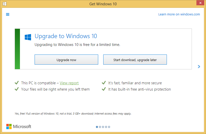
You get something similar with Windows 10. On a Windows 8.1 host you initially got the little icon in the bottom right corner. Then it started to pop up a little box in the corner. More recently it brings up a big window that doesn't give you particularly great options, such as "No thanks, I don't want it".

From what I've heard on Twitter, if you accidentally select to install your free upgrade to Windows 10 there is no going back!
I appreciate Microsoft are trying to move people onto the latest and greatest (although I'm not convinced the latest OneNote and Windows are their best for all users; although the latest IE is pretty good), but they could be a little less aggressive about it.

Your only option is to "Upgrade Now", although you can close this using the X in the corner. There's no "Upgrade Later" option.
You get something similar with Windows 10. On a Windows 8.1 host you initially got the little icon in the bottom right corner. Then it started to pop up a little box in the corner. More recently it brings up a big window that doesn't give you particularly great options, such as "No thanks, I don't want it".

From what I've heard on Twitter, if you accidentally select to install your free upgrade to Windows 10 there is no going back!
I appreciate Microsoft are trying to move people onto the latest and greatest (although I'm not convinced the latest OneNote and Windows are their best for all users; although the latest IE is pretty good), but they could be a little less aggressive about it.