London Olympics
Monday 4th June, 2007 13:50 Comments: 1
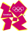
They have a logo. I don't like it. I can see what they're trying to do, but it's still rubbish.

The shapes form the numbers 2012, but the shapes also look like two figures (perhaps long jumpers?). But they could have gone with a nicer colour scheme. It reminds me of graffiti, but with an element of intelligence behind the design.
Did I mention I don't like it?
EDIT: Oh, of course, I think the "person" on the left is perhaps meant to be running through the tape (with London on it) at the finishing line. Except they don't do that nowadays.
 Fab - Monday 4th June, 2007 14:02
 "shapes also look like two figures (perhaps long jumpers?)."
Or a woman giving fellatio to a man? Seriously, the logo sucks *gags*. I reckon it was a joke entry and the artist must be having kittens by now! This logo is just wrong on so many levels. I can barely make out their supposed intentions.
Or a woman giving fellatio to a man? Seriously, the logo sucks *gags*. I reckon it was a joke entry and the artist must be having kittens by now! This logo is just wrong on so many levels. I can barely make out their supposed intentions.